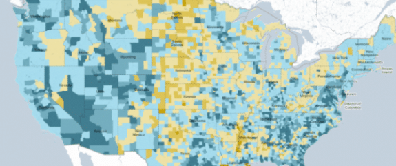
No, this isn’t a current map of U.S. flooding zones. This is a map, released by the NY Times, displaying the data from last year’s census. You can look at it as vague as the entire country (as seen above) or you can zoom in so close that you can actually see the street you live on. Then, when you select a state, county, or census region, it gives you detailed information on population increase or decrease, as well as a break down on the people that live in that area. To check it out for yourself, click here to go to the interactive version from the NY Times.
Related articles
- 2010 Census Data and Korean BBQ Tacos (policymap.com)
- 2010 Census and ACS data is free on PolicyMap (policymap.com)
- Census 2010: A Dramatic Decline in Black Residents (fort-greene.thelocal.nytimes.com)
- Rechecking the census (stat.columbia.edu)
- Floridians spend least on education, Census Bureau Report Shows (politicore.wordpress.com)


